WeTravel
WETRAVEL LANDING PAGE
Responsive Web Design
The Challenge
How might we improve a landing page to more clearly articulate value proposition and attract users, both on desktop and mobile?
WeTravel is a two-sided marketplace for group trips. I led a landing page redesign for them to improve comprehension in six weeks.

My Role:
Team lead. I led a team of one other designer and one growth marketer to fully redesign the current Wetravel.to landing page and rewrite all copy.

Our Goal:
Improve comprehension of landing page (through qualitative evaluation) in six weeks.

Deliverables:
- Landing page hi-fi clickable prototype and mockups
- Spec export via Sketch Measure
- Final presentation to client.
The Process
Our Design Process
The Constraints
Multiple target audiences: Wetravel is a two-sided marketplace that targets multiple audiences, so its landing page needed to target three audiences, while remaining comprehensible for each.
Minimal Traffic / Marketable Content: As Wetravel is an early stage startup, the product only features ~20 current public trips, and less than 2000 users. Due to the low number of daily active users, A/B testing was not a feasible option, and the number of trips that could be featured or highlighted were very limited.
Results Sneak Peek
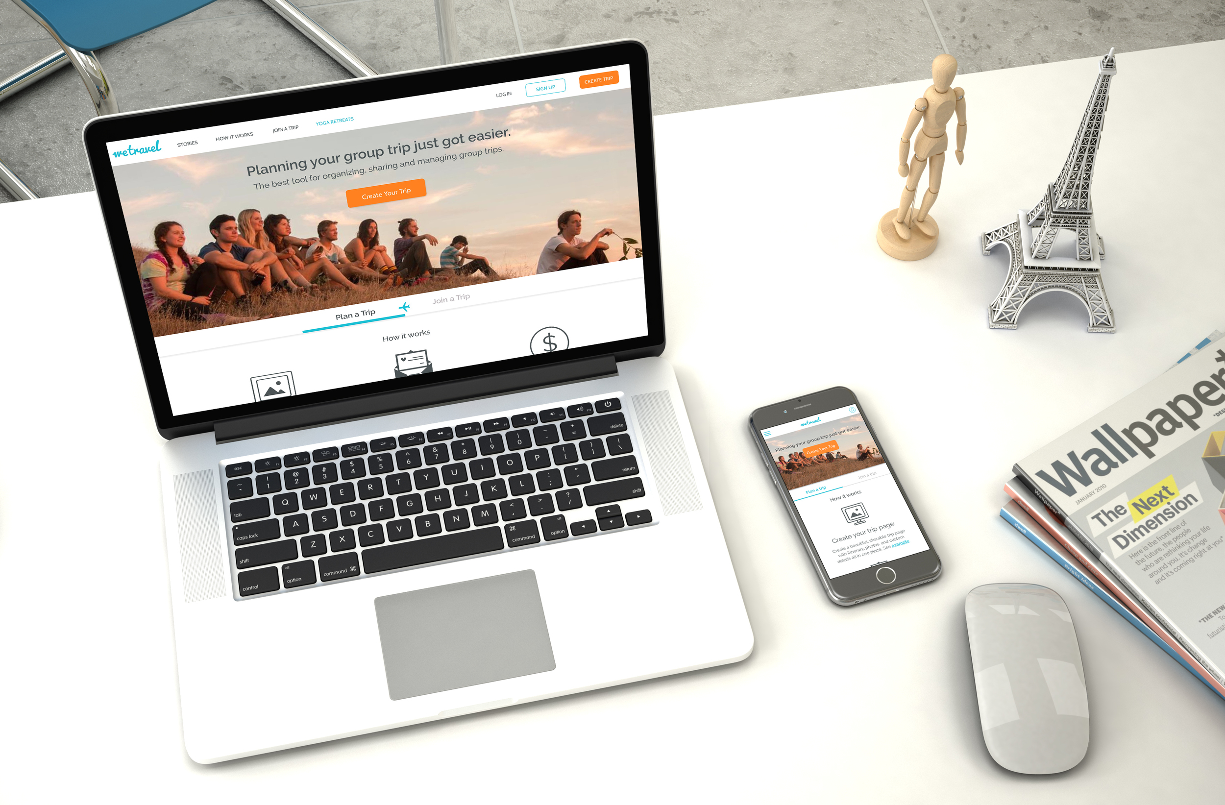
A sneak peek of the existing landing page vs. the team's redesigned page
Our final landing page performed 60% better than WeTravel's original landing page in comprehension testing, and 90% of testers said they were excited to use the product!
DIGGING DEEPER:
Round 1 Usability Testing
As WeTravel.to was an existing website, the first step of our process was to conduct usability testing on the existing site.
Before the testing we created personas, containing assumptions about three types of WeTravel users which we later validated:
We conducted comprehension testing on the existing landing page with 5 users that potentially represented our personas:
Some questions we asked were "What do you think this is at first glance?" and "Who do you think this product is for?"
From there, we consolidated findings, deriving the main points of confusion users had about the current page.
Affinity Mapping our Findings
We affinity mapped these pain points and synthesized our findings to 6 key ones. Then, for each pain point we formulated a hypothesis to guide our design decisions. These hypotheses would later be validated as we tested our designs:
Working with my growth marketing team member, we also tested the existing website headline with 10 users, as well as 5 alternative headlines resulting from a brainstorm with the client. Questions we asked included "What came to mind after reading that?" and "Please rank them in the order of your favorite to least favorite."
Headline testing!
From testing, the 3 most popular and comprehensible headlines were:
- Planning your group trip just got easier- Organize travelers and collect money (2 line)
- Planning your group trip just got easier
- Organizing a group trip has never been easier
We used a version of the first place headline in our final design.
Design Studio
Armed with our findings, consolidated pain points, as well as research on competitors, we held a design studio participatory brainstorming session, inviting client stakeholders, including WeTravel's founder and lead engineer, to participate. The studio helped us involve the key stakeholders in the design process from an early stage, and ensured we were hitting business goals and taking into consideration engineering constraints.
Goal: Brainstorm ideas for a landing page that will appeal to all of WeTravel’s target audiences and convey the brand’s value prop in a visually appealing way.
Scenes from our design studio
At the design studio, we decided to create and test two versions of the landing page- one with a tabbed front page to target the trip planner and trip joiner, and one using user profiles to help relate to different audiences:
Initial whiteboard wireframes for the two versions
Working with the other designer on my team, we then translated the initial wireframes to a first version high fidelity prototype, mocking up the hi-fi screens in Sketch and using InVision to create the clickable prototype. We then moved into our week of rapid iterations!
Prototype, Test and Iterate
In our week of rapid iteration and testing, we churned out six iterations in five days! Some key findings and changes we made include:
Converged Two Versions: On day three, we converged the two versions of the landing page according to the features that performed well in each. We ultimately went with the tab structure as the main way to differentiate between audiences, but kept the user profiles for social proof and moved them to the bottom of the page.
The tabs as they appeared in our final prototype
“Stories” of current users: We moved the the original user profiles section to the bottom of the "Plan a Trip" page, and optimized it to include WeTravel's three core user groups, as well as a hover overlay with a little copy on how each person used WeTravel. Here's how this feature evolved through iterations:
User profiles as they appeared in our final prototype
Final Validation Testing
Our page was now ready for final usability testing. We conducted testing with 10 users, a mix of business school students, yoga teachers, and independent trip planners.
We tested users with the same methodology that we completed our rapid iteration round with, in which we asked users to give first impressions of the site and then dive deeper, answering questions like:
- Imagine you are sitting at home, browsing the internet, and came across this page.
- What can you do on this website?
- Who do you think this website is for?
- What draws your attention?
Testing Results and Final Optimizations
Testing results proved that our week of rapid iterations was a success, with users responding well to landing page imagery and demonstrating clear understanding of what the product was for.
We also uncovered great final insights that helped us make final optimizations to the landing page:
1. Some users thought the “Sign up” button on the top right of the sticky nav was too eye-catching, and were more drawn to that than the main CTA. To combat this, we reduced the visual salience of the sign up button:
Sign up button before and after
2. Some users found that the main imagery on the "Plan a Trip" page didn't evoke a sense of travel. We switched out the image, but recommended that the client further A/B test this page to ensure it was suitable:
Landing page imagery before and after
3. Some users thought the second CTA at the bottom of the landing page was repetitive in wording , so we modified it to add some variety:
Second CTA before and after
The Final Product
The final landing page performed extremely well, and blew all of our hypotheses out of the water. We successfully validated all six of our hypotheses, with more than 60% increase in comprehension. All around, testers had greatly increased understanding of product functionality, value prop, and target audience.
In fact, 90% of our testers were excited about using the website and asked when the new version would be available.
I created hi-fi mockups of the landing page in both desktop and mobile web versions for the final deliverable, as our landing page was designed to be fully responsive and scalable across all devices. Check out the final prototype here: https://marvelapp.com/e0cgg1.
The "Plan A Trip" Page
The "Join a Trip" page
Learnings & Client Feedback
WeTravel was an amazing project to work on, and I was thrilled to have the opportunity to lead a project with a client who was such a proponent of collaboration and so open to our design suggestions.
Collaboration was also key within the design team, as I worked closely with another designer on landing page designs, and oftentimes there needed to be give and take. Ultimately, we let user feedback inform all of our important decisions, resulting in a beautiful, usable page that the entire team was extremely proud of.
"May led the landing page redesign project for WeTravel Inc, and under her leadership the team far exceeded our expectations. They executed incredibly thorough and insightful user research, and proceeded to rapidly prototype dozens of versions of our landing page, constantly testing iterations with real users. The final outcome, a fully redesigned landing page, was nothing less than stunning. Initial user feedback is extremely positive and has led to a huge increase in conversion on our site.
During the whole process, we were blown away by May and the landing page team's professionalism. May displayed an incredible drive and worked hard to perfect the product, all while never surpassing a deadline. The quality of the work delivered far exceeded anything that we have experienced from working with other freelance designers and even established design agencies."
- Johannes Koeppel, Founder of WeTravel
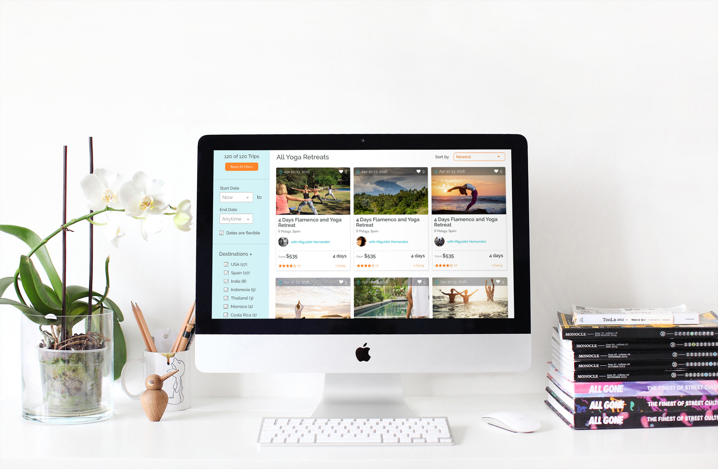
Continued Work
Johannes asked me to stay on with WeTravel to build out another portion of their site for yoga retreats. Check out a sneak peek of the design below, and read about my process here!